Aug 15, 2017 • Apartment
Duxplex in Kurokowa is a Family Home That’s Small on Footage but Big on Space

This project, simply titled Duplex in Kurokowa, is part of a new development in Wrocław, Poland. It’s based in the up-and-coming district of Nadodrze, and is set alongside the Odra River.
The multi-family development was designed by architecture firm 3XA, and since it’s completion in 2016, it has won numerous architectural awards. 3XA’s approach was to combine form and function, with Scandinavian-inspired finishes.

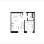
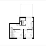
Duplex i Kurokowa is an example of the development’s properties. It contains an area of 914.93-square-feet (85-square-meters) spread over two floors. Functionality was at the forefront of the designer’s minds – they wanted to produce a series of dwellings that would promote family interaction.

As a result of their family focused orientation, they managed to squeeze in three bedrooms, two bathrooms, an office/study space, and an open plan living room/dining area/kitchen. Window opportunities are quite limited; the open plan living space it lit by a singe, but large window. They also opted for material finishes that will help promote “lightness” (namely in the form of white floors, walls and ceilings).

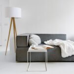
From the architects: “Elements were deliberately kept light and neutral, with white serving as the dominant color for the resin floors, walls, and various furnishings. Simplicity was highlighted with the use of plywood that provided a degree of warmth and served as a uniting motif throughout the apartment – functional yet decorative.”

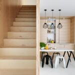
This minimalist aesthetic extends to the staircase. It’s a simple, no frills design, made entirely from plywood. To spare the floor area, many features were built along the perimeter of the apartment. Larger items, such as the refrigerator, a chest of drawers, and a small utility room, can all be found under the staircase.

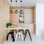
The kitchen also takes advantage of a few space-saving ideas. The upper cabinets extend from the ceiling down to the counter top. It also has the added effect of creating a simple, clutter-less look. Thought was also given to the lighting: “The final touch was provided by dichotomizing the light sources. Indiscernible housings mounted at the ceiling level provided ambient light whereas bold, black fixtures were used for accent lighting.”

For more small apartments check out “Hey!”, a colorful little home from Taipei by A’Lentil Design. Or, Loft L, a Parisian artists studio turned residence. See all apartments.
Photos © Stanisław Zajączkowski
Join Our Newsletter And
Get 20% Off Plans
Get the latest tiny house news, exclusive
offers and discounts straight to your inbox

