Aug 10, 2016 • Apartment
Apartment 37 – A Smart, Slick Remodel for an Older Chinese Property

Simply titled Apartment 37, this renovation takes place in an old residential block found in Shanghai, China. The seven-story building is located in the downtown district of the city, and this particular apartment has a footprint of less than 431 square feet (40 square meters).
The architecture firm Atelier Mearc were responsible for the overhaul. They focused on created a light, bight space with interconnected rooms.

The actual current footprint is estimated to be 398 square feet (37 square meters). Despite its limited floor plan they’ve managed to create a series of relatively spacious living areas. The layout of the apartment is long and narrow, which lead to Mearc placing rooms sequentially.

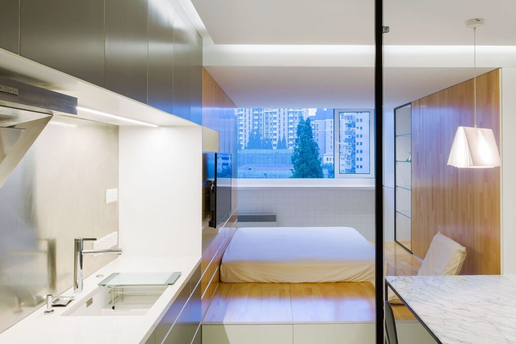
All existing partition walls were removed, revealing each room to one another, including the bathroom. A glass wall frames the bathtub helping to provide some degree of separation from the kitchen/dining area. The glass is quite a practical solution (provided you’re not shy) as it allows natural light to reach the very back of the property.

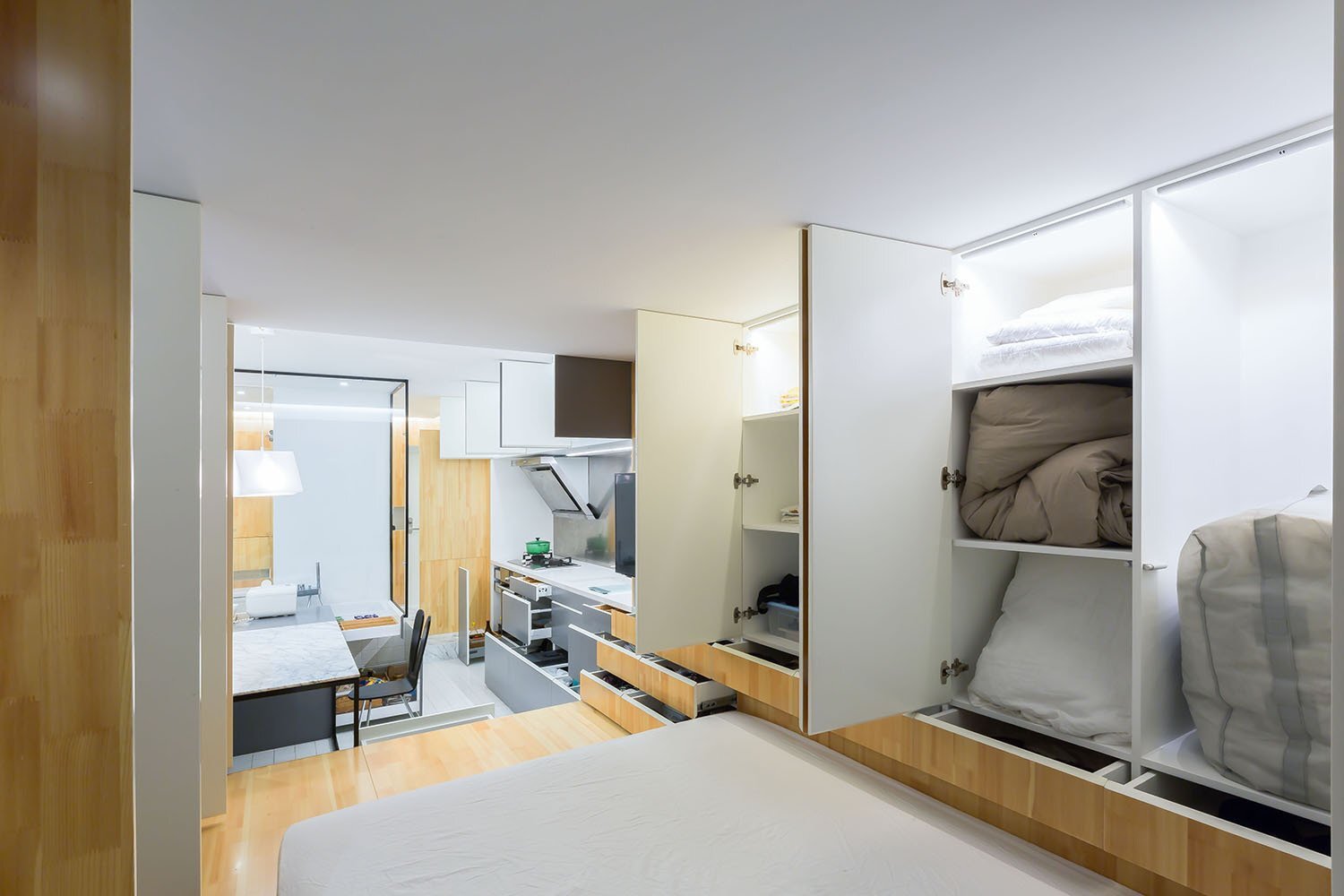
Glass has also been put to use as shelving in the dining area. However, the largest expanse of glass can be found in the bedroom, which features the apartment’s only window. Both walls running the length of the apartment have been lined with storage closets and compartments, providing ample storage for one or two people.

In terms of layout, the entrance is flagged by the bathroom and a small closet for coats and shoes. At the end of the bathroom you enter the kitchen/dining room/living room. The kitchen is found on the left-hand-side, while the dining/living area is set to the right.

The bedroom has been raised from the floor level, providing some extra storage while also separating it from the rest of the property. It leads on through to a small balcony that overlooks the city below. From the architects: “There are four spaces in all from north to south. By changing altitude of floor and ceiling and together applying different materials, the characteristic of the space is fully expressed and the distance extended when moving in. You feel it’s like in a courtyard.”
For more small and tiny apartments check out this property in Sydney that makes clever use of bespoke cabinetry to create living spaces. Or, this cool contemporary redesign by Igor Glushan. See all apartments.
Via ArchDaily
Photos: Lu Haha
Join Our Newsletter And
Get 20% Off Plans
Get the latest tiny house news, exclusive
offers and discounts straight to your inbox


