Dec 03, 2013 • Small HouseSpaces
Small Attic Apartment Conceals Rooms Within It’s Walls

This small loft apartment in Madrid has been designed by Spanish firm, Elii Architects. The apartment contains just 613 square feet of usable space and features some unusual but clever space-saving ideas built into its very walls, floors and ceiling.
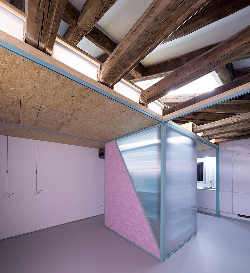
The interior is a blank canvas. There’s next to no furniture or appliances other than the built-in kitchen, and bathroom. The result is a relatively stark space, that is, until you start to interact with the building by pulling on levers, winding winches, and pushing/sliding elements.
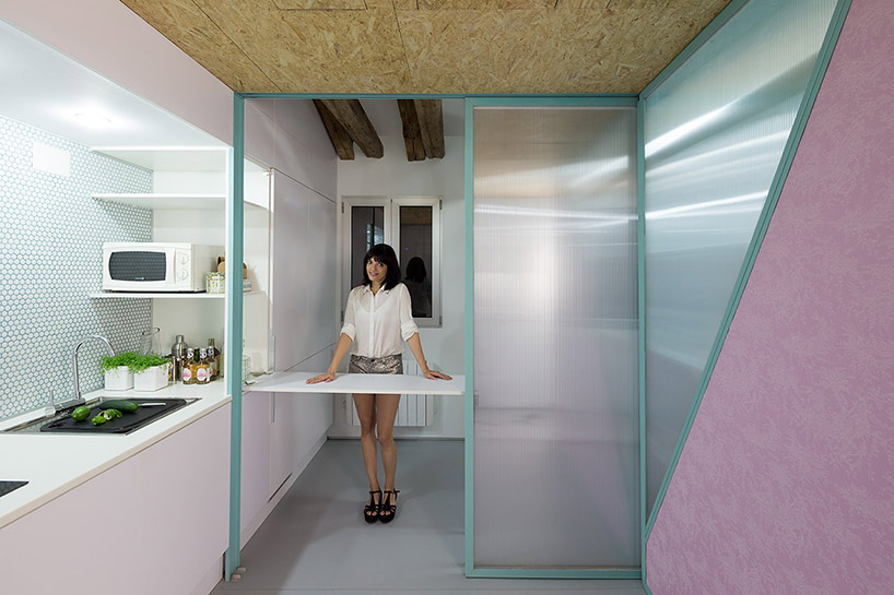
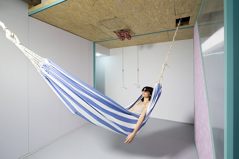
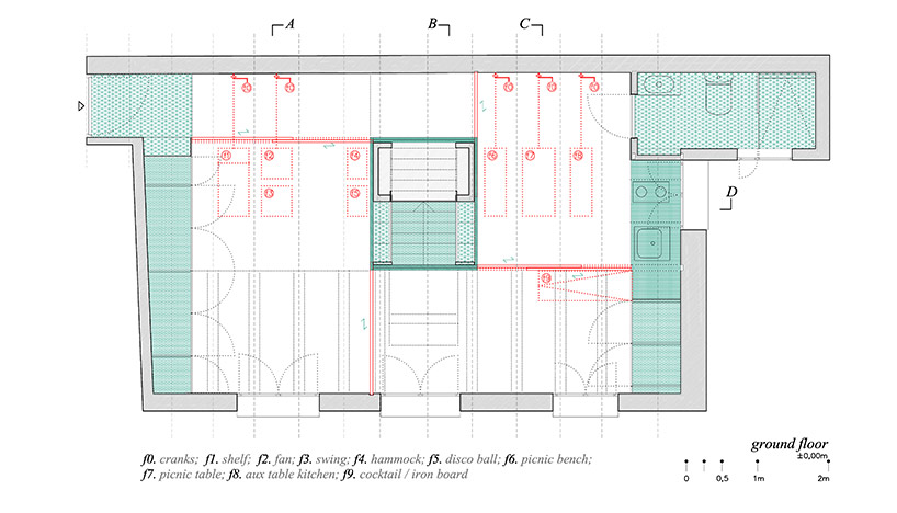
Throughout the apartment you’ll find a number of manual winches. Each of these winches can be used to reveal a hidden function or furniture piece that can transform the space into a “room” with a particular purpose. For example, in the kitchen the dining area drops down from the ceiling when it’s needed. Otherwise it can remain hidden, freeing up the kitchen space.
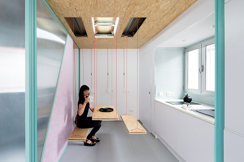
The interactive design allows the occupants to customize the interior layout, allowing it to be adapted for a number of functions and scenarios – feel like relaxing? Just pop up the hammock.

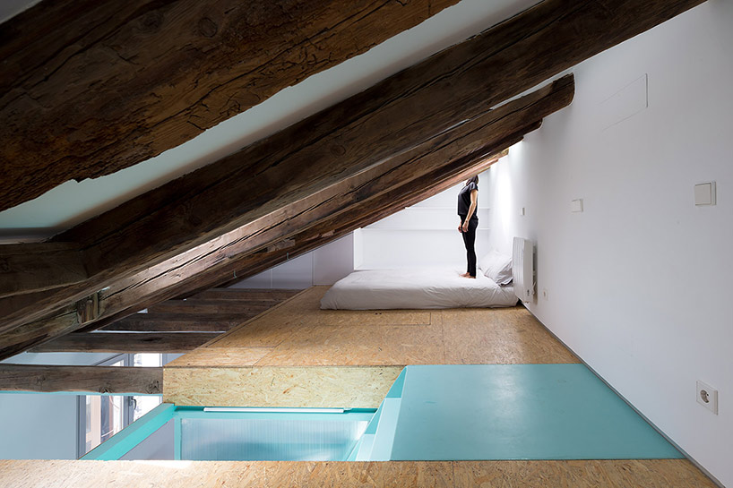
The existing space had to be renovated before it was suitable for use. The attic was cleared of all the existing elements, and turned into an open plan living space. The large heavy timber beams used to support the mansard roof also help to give it some character and context.
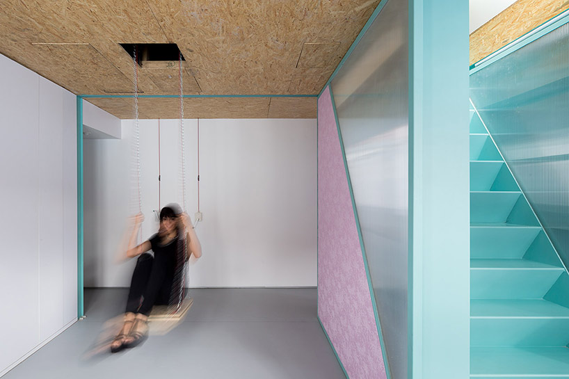
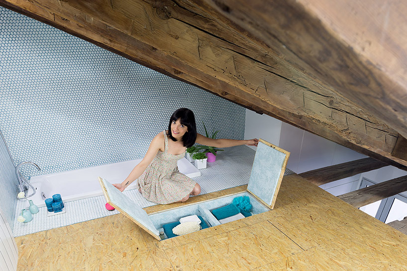
The center of the attic contains the stair system that provides access to the upper level, and contains shelving and storage units. It also serves to divide up the otherwise open plan layout. The mezzanine contains the bedroom – a rather simple affair with the mattress being laid directly on the floor, under a large skylight window. There’s also a sunken bathroom area with some features being accessed by lifting up floor panels.
The main living area can be divided by sliding-out the translucent partition walls, creating a sense of privacy if needed. Similarly the space can be opened up for social functions allowing for ease of interaction between the occupants. Another bathroom (with a toilet and shower) can be found on the main level, just past the kitchen.
Often the ceiling finish material (OSB) serves as the surface for an item of furniture, like the suspended dining table and its bench. Storage shelves for both the owners and guests have been incorporated into the ceiling, and are accessed by simply pulling on them.
While I’m not particularly taken with the finish, I do love the idea behind this project. Why shouldn’t the rooms within our homes be more interactive? A little extra effort is usually required with small houses, especially if they’re multifunctional spaces, that need to adjusted to suit our needs at a given time. I personally don’t think this is a disadvantage (there are probably some minor health benefits too), although it may not be a suitable approach for people with certain disabilities, or for the older generation.
UPDATE: After reading Christopher’s comment below, I’ve included a video of the apartment – enjoy!
For more spaces and small houses check out this modern home that’s been designed by LLP Arkitekkontor for a young Swedish family. Or you could have a look at Green Project Zero’s fun contemporary living space addition. See all small houses.
Via Design Boom
Photos: Miguel de Guzman
Join Our Newsletter And
Get 20% Off Plans
Get the latest tiny house news, exclusive
offers and discounts straight to your inbox

