Jul 01, 2015 • Apartment
Raanan Stern’s Bauhaus-Inspired 800 Square Foot Apartment

Set in a residential building in Tel-Aviv, this apartment recently underwent a redesign with the help of Israeli architects Studio Raanan Stern. The apartment, which was originally built in the 1930’s, contains an 807 square foot (75 square meters) floor plan.

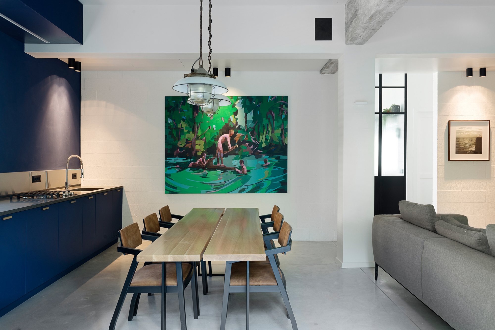
The interior has been loosely divided up into two main volumes, one public and one private. A large open plan kitchen, dining and living room occupies the first half of the home, while the more private areas, like the bedrooms and bathroom, can be found to the rear.

The finish takes inspiration from Bauhaus with bright open living areas, lit by large black framed windows. The furniture pieces and fixtures are also a mix of old and new. For example, the hanging lights in the dining area were salvaged from a dismantled factory in Czech.

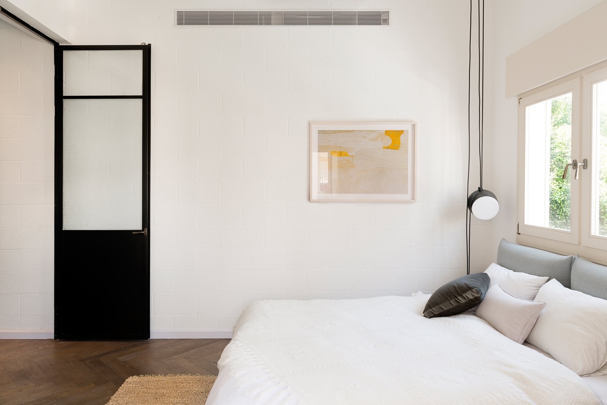
The windows and doors are identical to the ones originally installed in the apartment 80 years ago, both in terms of color and style. The wall that divides the bedrooms and bathroom from the main living area was built not only to separate the space, but also to create a mini-gallery for the owner’s paintings.

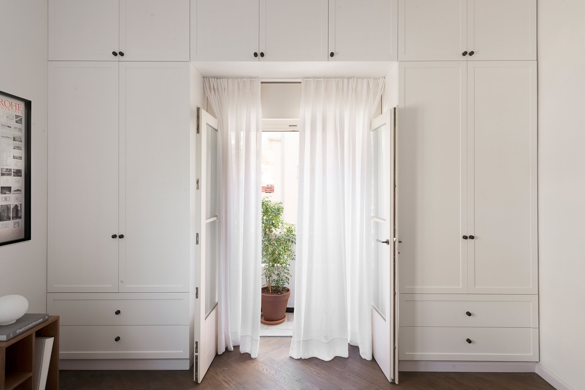
The apartment makes great use of custom cabinetry, which was planned by the architects based on the needs of the owner. In the bedroom the cabinets extend to the full height of the room, making the most of the vertical space. In contrast to this, the kitchen doesn’t appear to have any wall-mounted cabinets – perhaps the owner simply didn’t have a need for the extra cupboards.
In my opinion, the most successful room in the apartment is also the smallest – the bathroom. It’s light and airy, and features a large walk-in shower. The plants placed on the metal grill shelves also help to reduce the clinical aesthetic and introduce something organic to the room.
For more apartments check out this fun and functional home by Moscow-based architects, Ruetemple. Or, White Stone Studios, a series of modern micro-apartments in downtown Phoenix. See all apartments.
Via ArchDaily
Photos: Gidon Levin
Join Our Newsletter And
Get 20% Off Plans
Get the latest tiny house news, exclusive
offers and discounts straight to your inbox


