Feb 11, 2016 • Apartment
How to Make More of Less – A Shanghai Apartment by MoreDesignOffice

The bustling city of Shanghai is no stranger to small dwellings, but making the most of the space available in those properties is less common. The architecture firm MoreDesignOffice were enlisted to help transform this apartment from dark and poky, to bright and spacious.

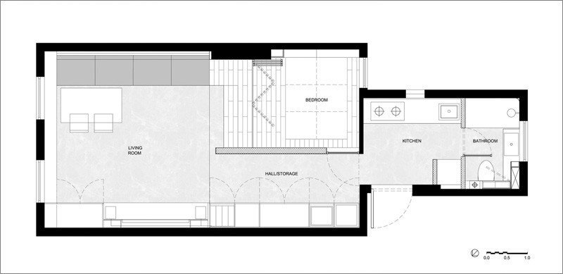
The apartment is laid out in a linear format. The entrance leads directly into the kitchen, with the bathroom found on the right. To the left of the kitchen you’ll find a hallway that’s lined with storage and leads into the main living room. A corner of the living room has been section off to create a bedroom.

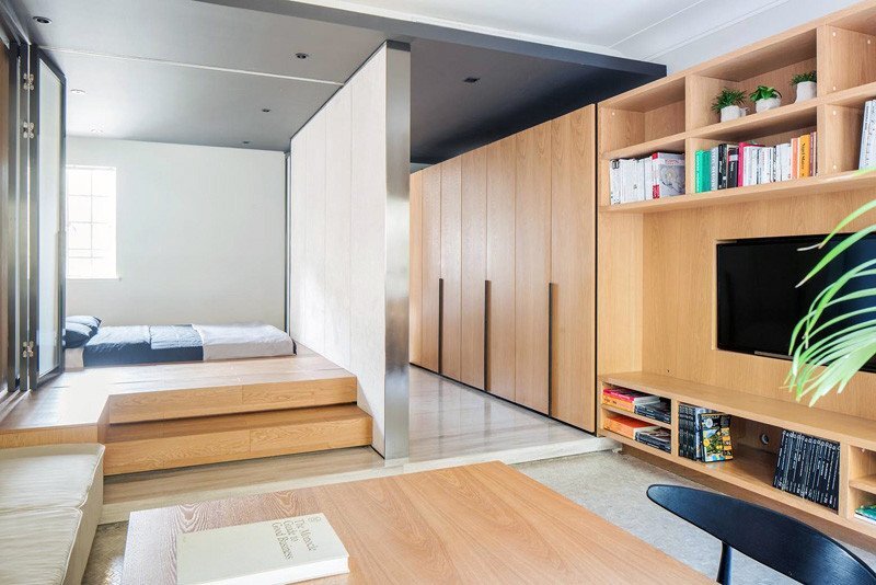
Despite only having five windows, the entire apartment appears to be bright and airy. The plain white wall finish helps to promote natural light, while the folding partition doors between the bedroom and living room feature translucent glass, sharing diffused light between the two rooms.

The bedroom is contained in a raised portion of the home, providing a degree of separation from the main living area, while also creating some much needed storage space underneath. The steps leading up to the bedroom are used as seating for guests when needed.

They’ve also used mirrors to great effect, like in the corridor between the living room and kitchen – it features a full-height mirror, that helps brighten the space where there are no windows available. The only area to feature a dark finish is the kitchen, however that’s combated by the sink window.

Translucent glass has been used for the bathroom door too, sharing light between it and the kitchen. All in all, I think it’s a clever, elegant design that delivers on both form and function.
For more apartments check out this 540 square foot loft in New York. Or, this sleek minimalist home from Amsterdam by the designer Frederik Roije. See all apartments.
Via Contemporist
Photos: MoreDesignOffice
Join Our Newsletter And
Get 20% Off Plans
Get the latest tiny house news, exclusive
offers and discounts straight to your inbox


